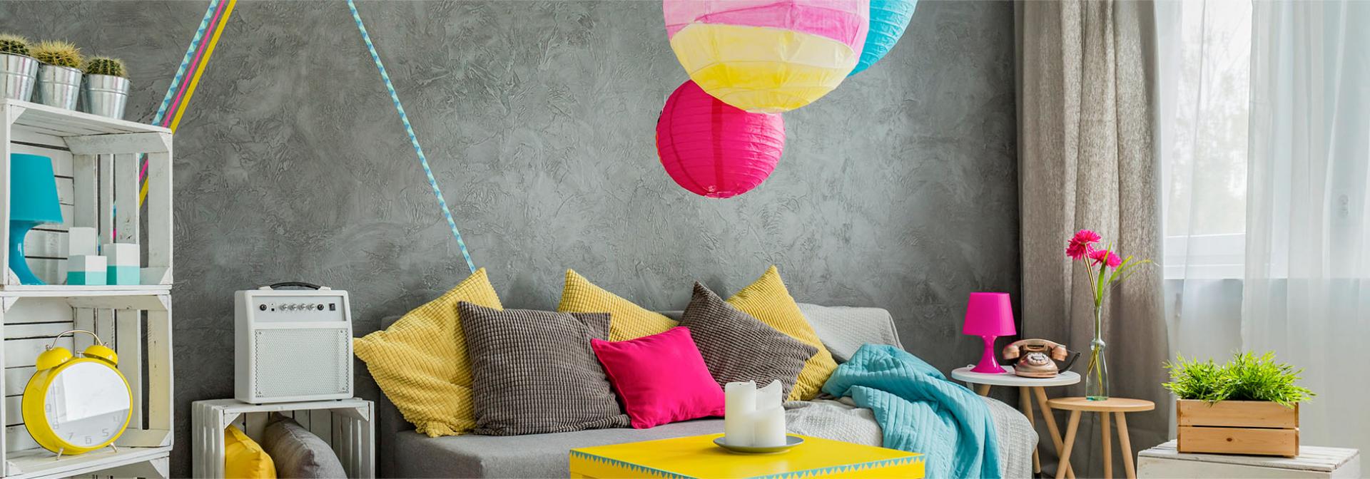
Brighten up your home with cheerful hues to stylishly bring in happiness and harmony. We tell you how.
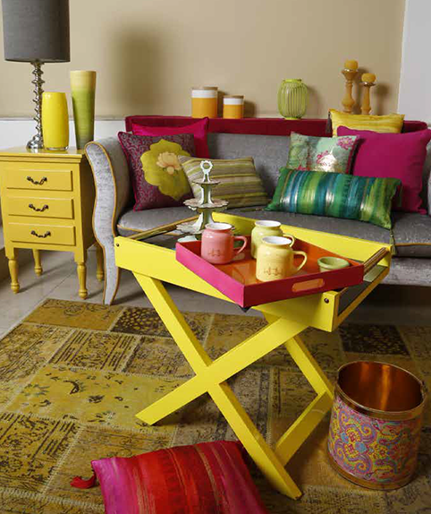
When decorating a room, divide the colours into percentages: 60% dominant colour (walls), 30% secondary colour (upholstery) and 10% accent colour. One of the challenges of mixing and matching patterns is the ability to determine what will look good together and what will clash. Before you concern your mind with pattern, look to a colour palette that you love. When choosing colours, decide if a warmer colour or cooler colour will work best.
Don’t shy away from bold colours. The wonderful part of choosing patterns to mix and match is the wide range of vibrant hues to choose from. Jewel tones in rich burgundy; garnet red and aquamarine blue look lovely on zebra print side chair! Choose prints that have a monochromatic design and that don’t compete visually with the bright pops of colours around it.
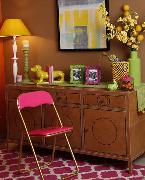
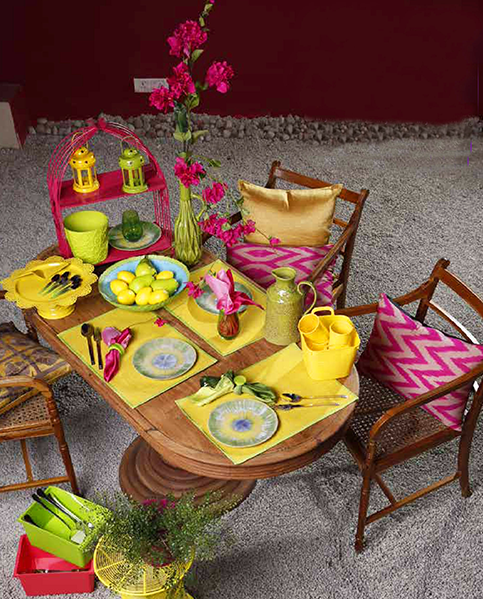
All colours depict a certain emotion. So, decide on the pops of colour according to what you want to showcase in that particular room. Choose prints and patterns from your recent travels. Pick up native fabrics to get a head start. Use patterns and prints and mix and match them with solid coloured hues in your living spaces or even on your bed to bring life to your dull room. You will be surprised how just a few native fabrics from your most recent destinations will create an interior you love.
Home calculations made easy to help you plan your home
Related Posts


MISSED CALL
Give us a MISSED CALL for New Home Loan
- 09289200017